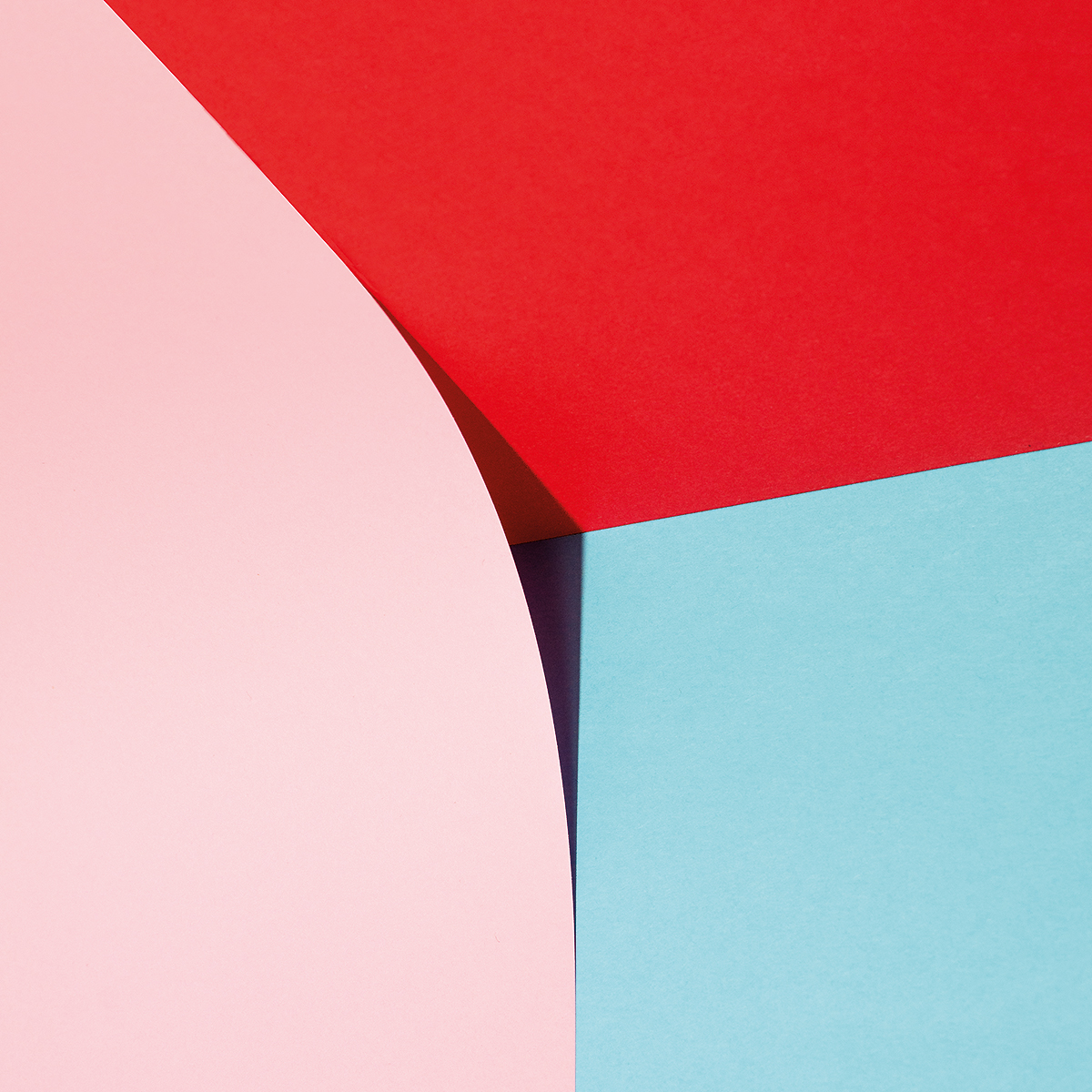

Our latest portfolio crush lies at the intersection between German minimalism and Mediterranean temper, photography and graphic design.
Linus Lohoff is the Barcelona-based art director and self-declared visual junky you want to to keep an eye on. Here’s what we learned about his creative mindset.
What kind of person are you and what do you like doing most?
I am German with Brazilian roots and live in Barcelona. I currently work as an Art Director in the design studio Vasava while enjoying life in this wonderful city. I would say I am an optimistic-realistic kind of soul, messy but not too messy, with a strong sense of curiosity towards all things surrounding me. Since I'm physically 100% Brazilian, but have been socialized in Germany, I feel like my character brings both mentalities to shine. For this reason, I believe, Barcelona is the perfect city for me. Good weather, charmingly chaotic, creative, diverse, hedonistic, but also innovative, international, traditional, and full of contrasts.

How did you discover your passion for photography?
My father’s first job was as a photographer. He really had this deep technical education and was more of an architecture and product photographer. And yet, he never missed an occasion to make a lot of photos with the family, so there are lots of childhood photographs, a bunch of which show me playing with his cameras and equipment.
Despite this anecdote, I got into photography quite late. I was more into music, playing the drums, being in a band, and nerding around with Magix Music Maker. My daddy gave me his old Nikon FE when I was around 18 years old and BOOM! There it was, another passion! I started to play around with black & white photography, with cross-processing and was totally sucked in by the Flickr community ... back in the day, when it was cool and fresh.
What is the first “shoot” you can remember?
It was at home in Germany. We had a dark wall in the living room and my sister was wearing all black. She would almost disappear against that wall. Only her face and her hands were standing out of the infinite background. It was nothing special, but I remember, I liked to work with this medium format camera and the results on film, afterwards, were amazing to me. This illusion of camouflage … so yeah, I guess this was my first shoot.

“Digital reading is fast food, physical reading gourmet.”

It is what it is, Nr. 11, Jan 2016, @linuslohoff
Your photos are very clean, minimal, and focus on just a few colors—What led you to develop these particular traits?
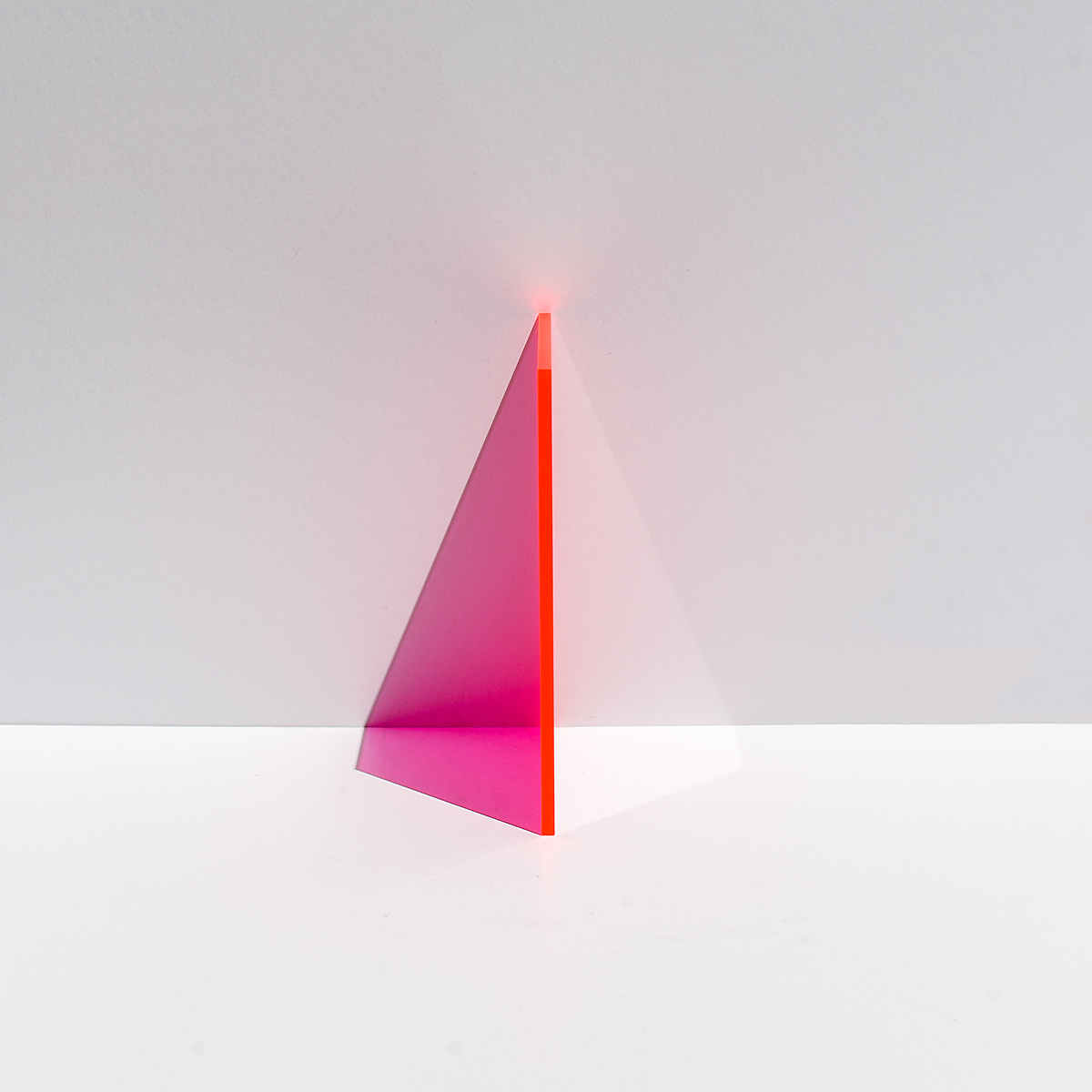
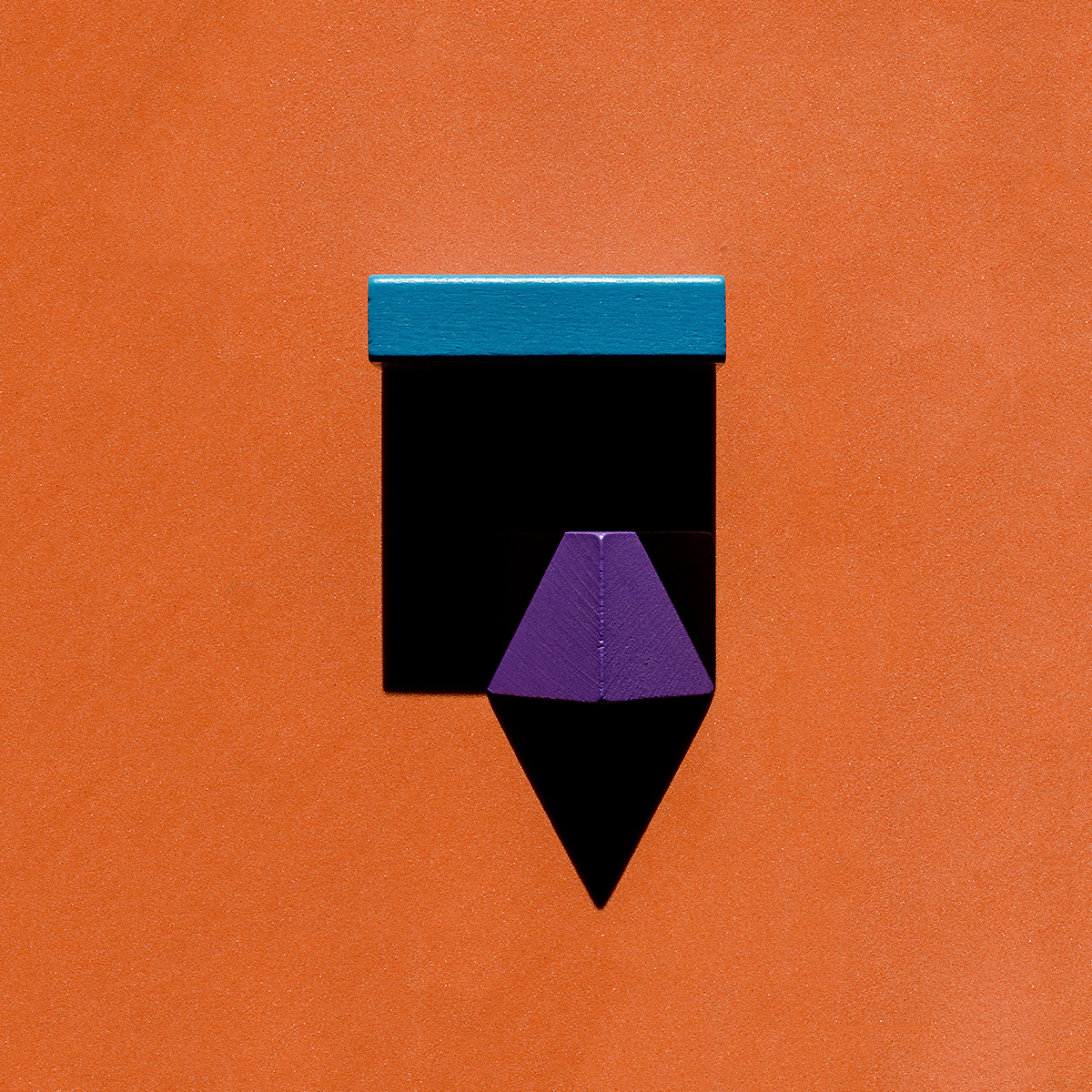
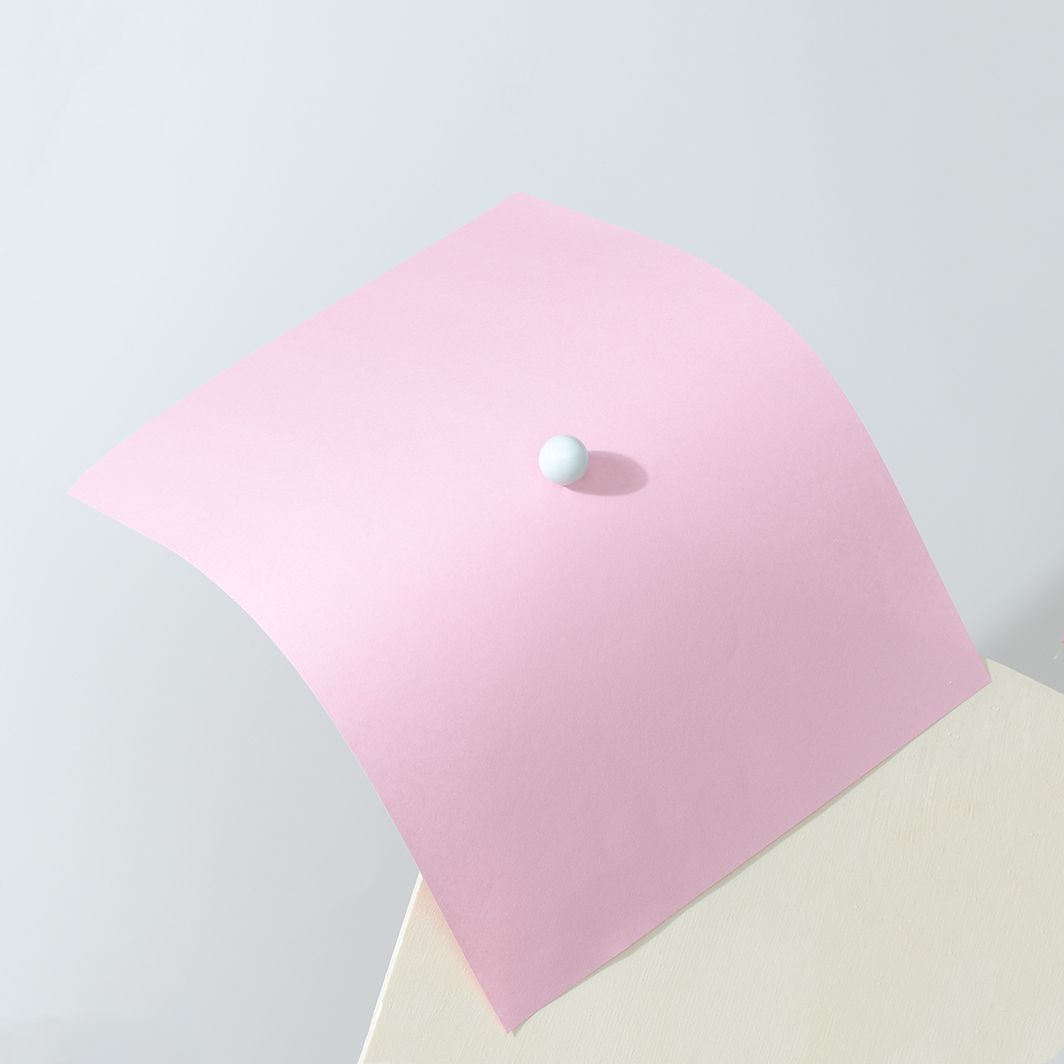
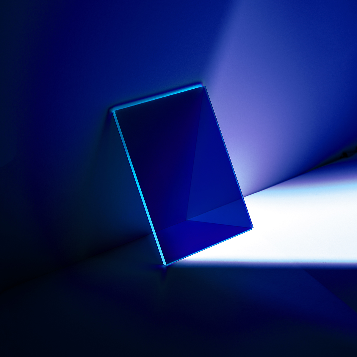
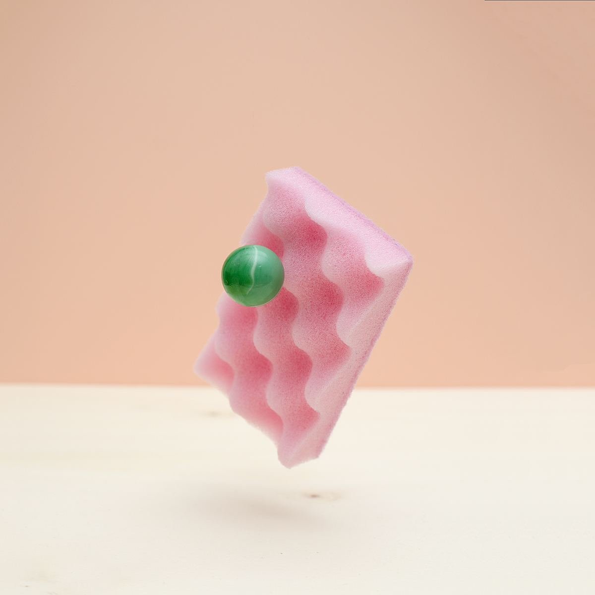
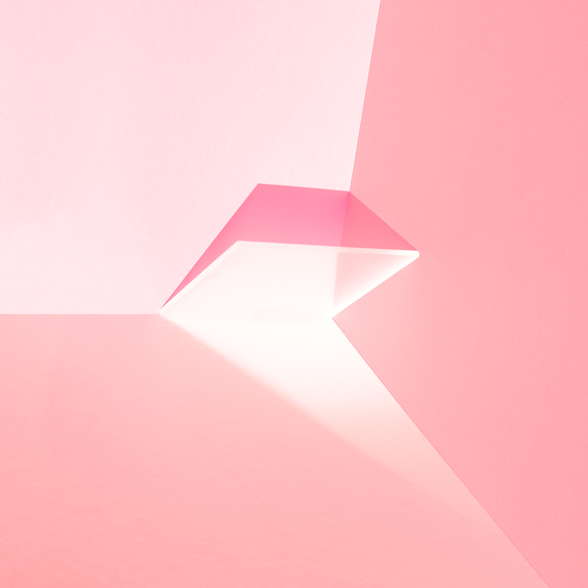
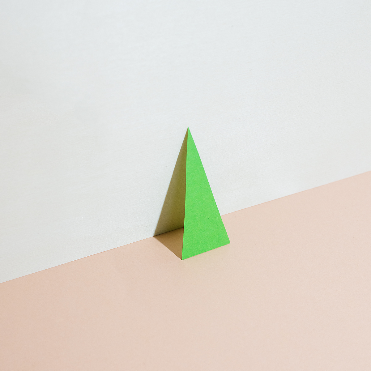
Yes, I would underline that my style is minimal and clean. Few colors ... I like vibrant colors but also tone-on-tone palettes. It depends on the idea I am trying to bring to life. I believe that my photography is really graphic. I don’t consider myself a photographer though. I’m an Art Director who likes to take pictures—the camera being my favorite medium. It is a swift tool to catch ideas, whether it’s my iPhone, my DSLR, or analog cameras. I studied Communication Design and surely this influenced my visual language—I cut out all unnecessary things in a photograph and want to show the essence of the idea.

What do you enjoy most about art direction as opposed to photography?
Depending on the project, photography is mostly included in Art Direction. Art Direction is a more intellectual practice, while photography is more physical in my case. When I have an Art Direction assignment it’s more about thinking and considering all visual codes like form, color, material, typography, photography, language, and concept. I enjoy the research, making presentations, visualizing / developing and visualizing a world around an idea. When these ideas come to life the way I want them to, that’s great, but most of all I like the process leading up to that visual world and language.
Being an art director makes you an expert in things perception. A lot of visual communication and creative work runs through a screen nowadays. In your opinion, how does looking at something, a magazine for example, without being able to touch it affect our experience of that media?
Compared to any screen, little or big, magazines are three-dimensional and real physical objects. A magazine doesn’t need electricity to be seen nor is there a chance that it will stop existing. I mean, an iPad-Magazine won’t exist forever! It will get lost in hardware and software updates. Instead a real magazine can outlast time. We still have Twen magazines from the 60s, but I can’t open the iPad-Mag POST from 2011 anymore because my iPad is too old and weak or because the creators of POST haven’t updated their software. Digital reading is fast food, physical reading gourmet.

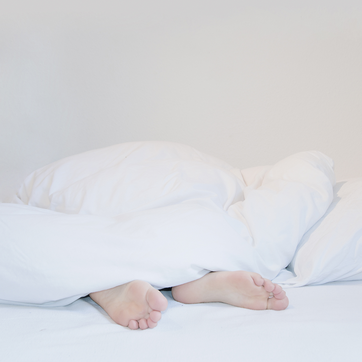
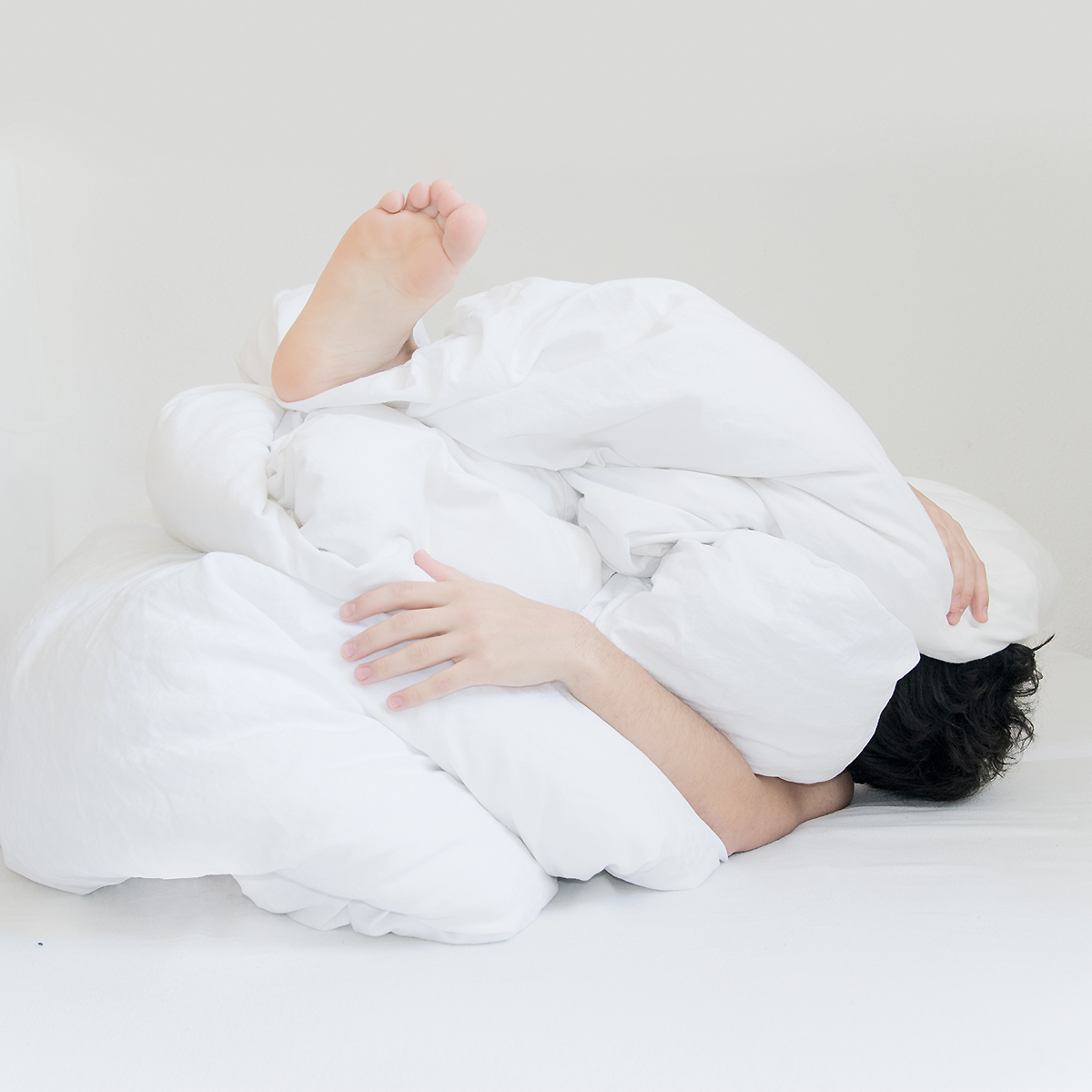
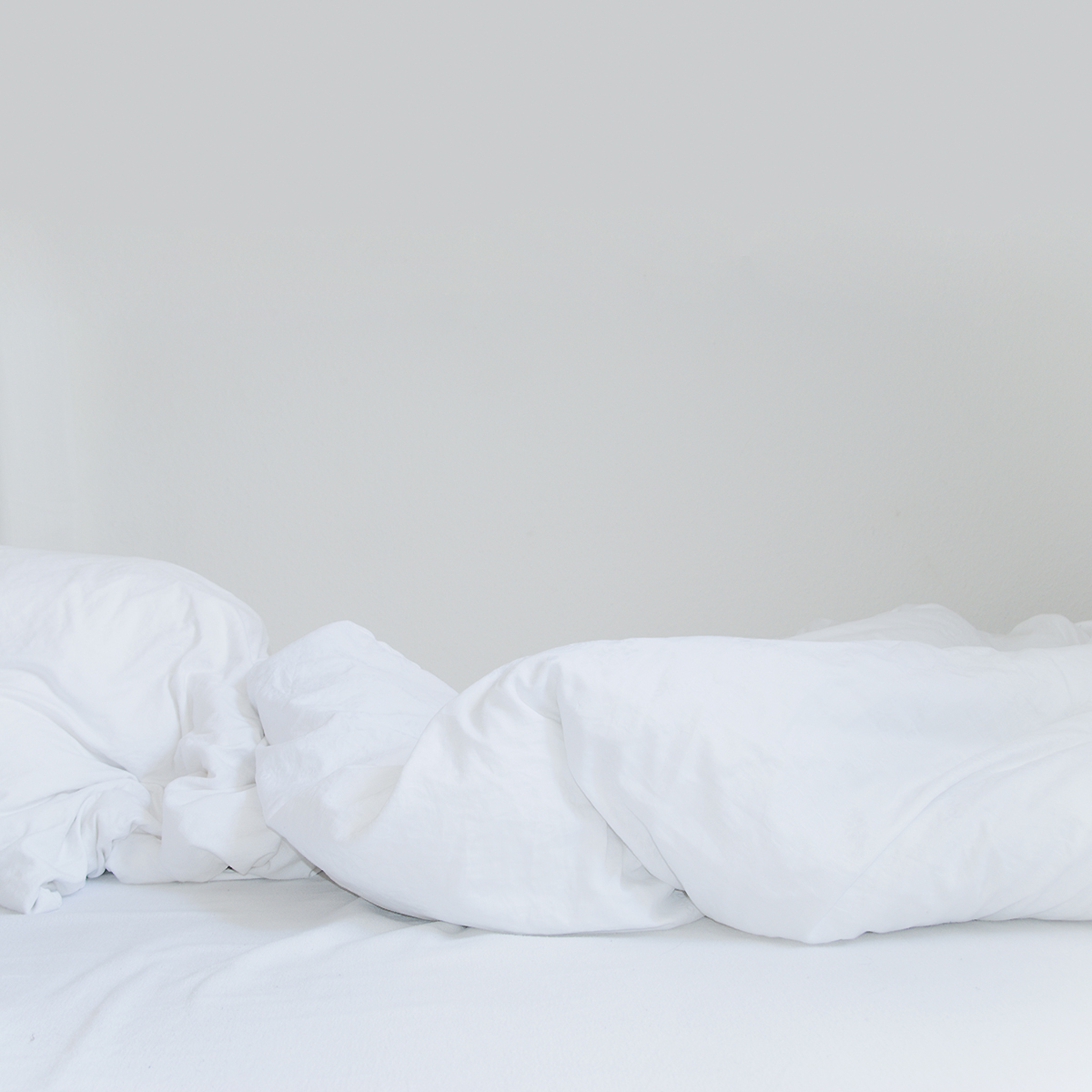
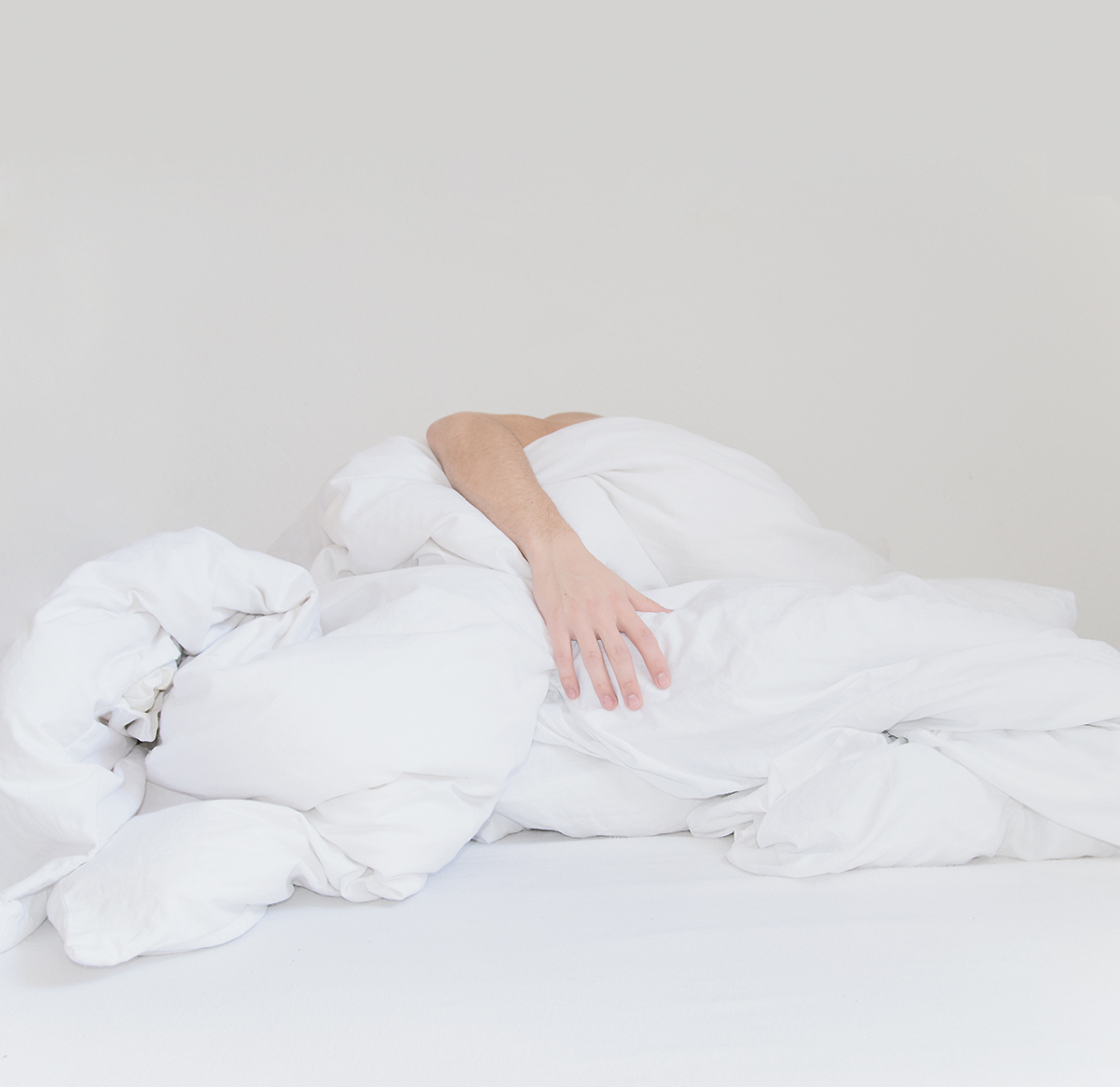
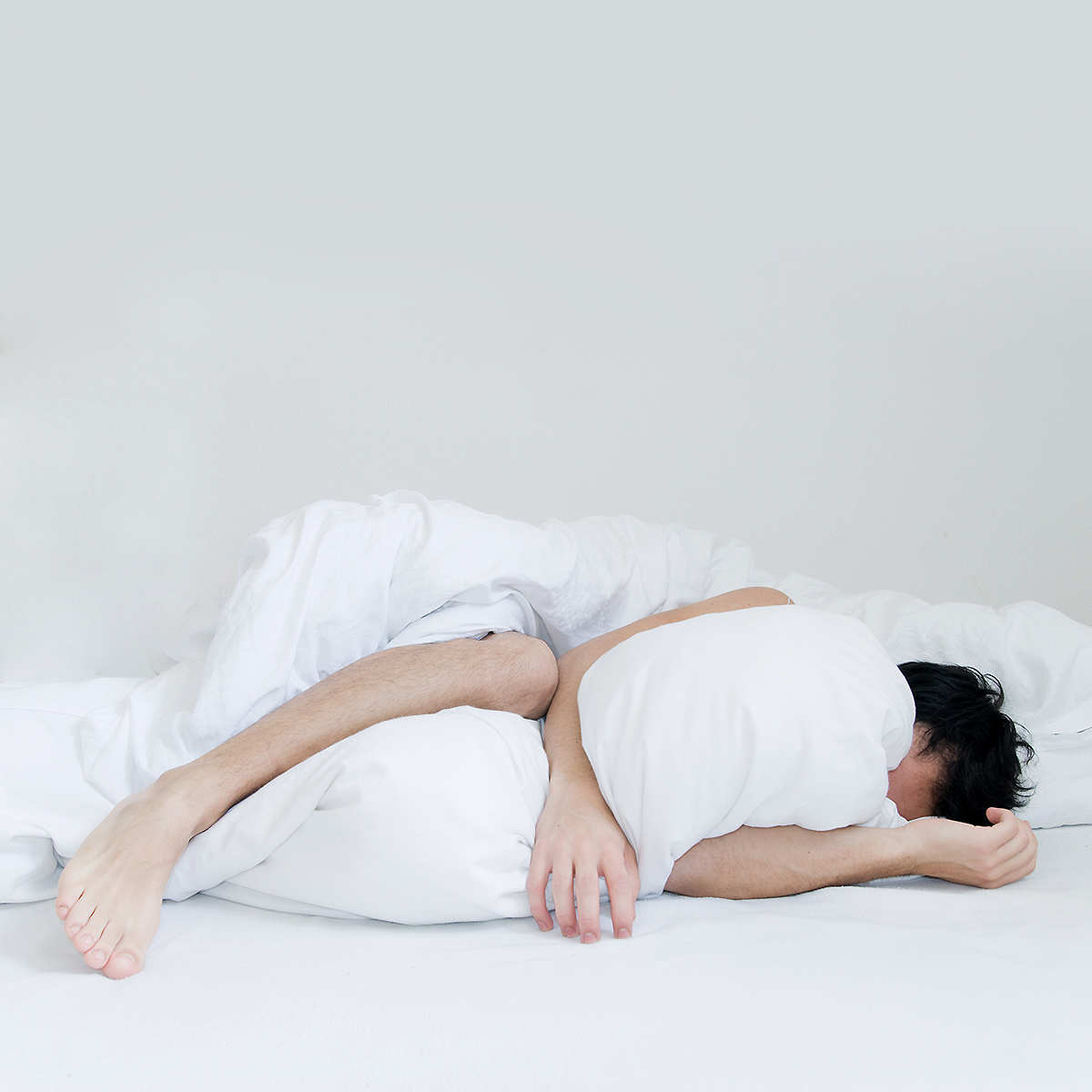
What is the idea behind your series Graving?
This series is one of my most personal ones. It’s actually the only self-portrait series I have. Graving is a pun on the two terms “grave” and “craving”. The quintessence here is the longing for someone and it’s expression. I had a long-distance relationship and whenever the person was visiting me the place to stay was the bed. We made so much love that we couldn’t get out of it. It was addictive / an addiction. It was a craving. When the person left I had this feeling of loss. I couldn’t sleep, had a lot of thoughts, nightmares, trouble finding the right position etc. The white bedclothes are just an aesthetic choice. White was the dominant color in every flat I lived in.
“I’m not doing photography full-time. I’m creative full-time.”
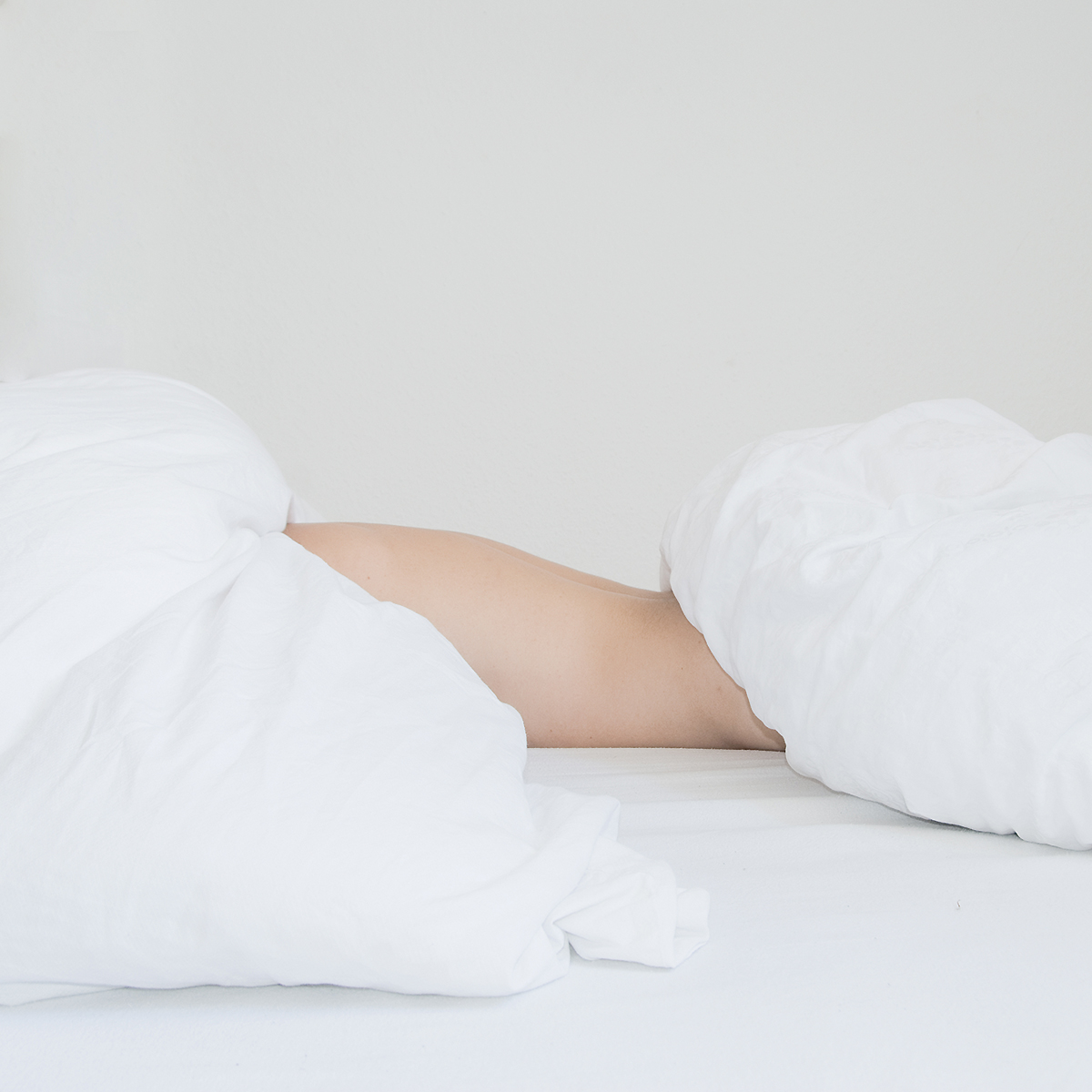
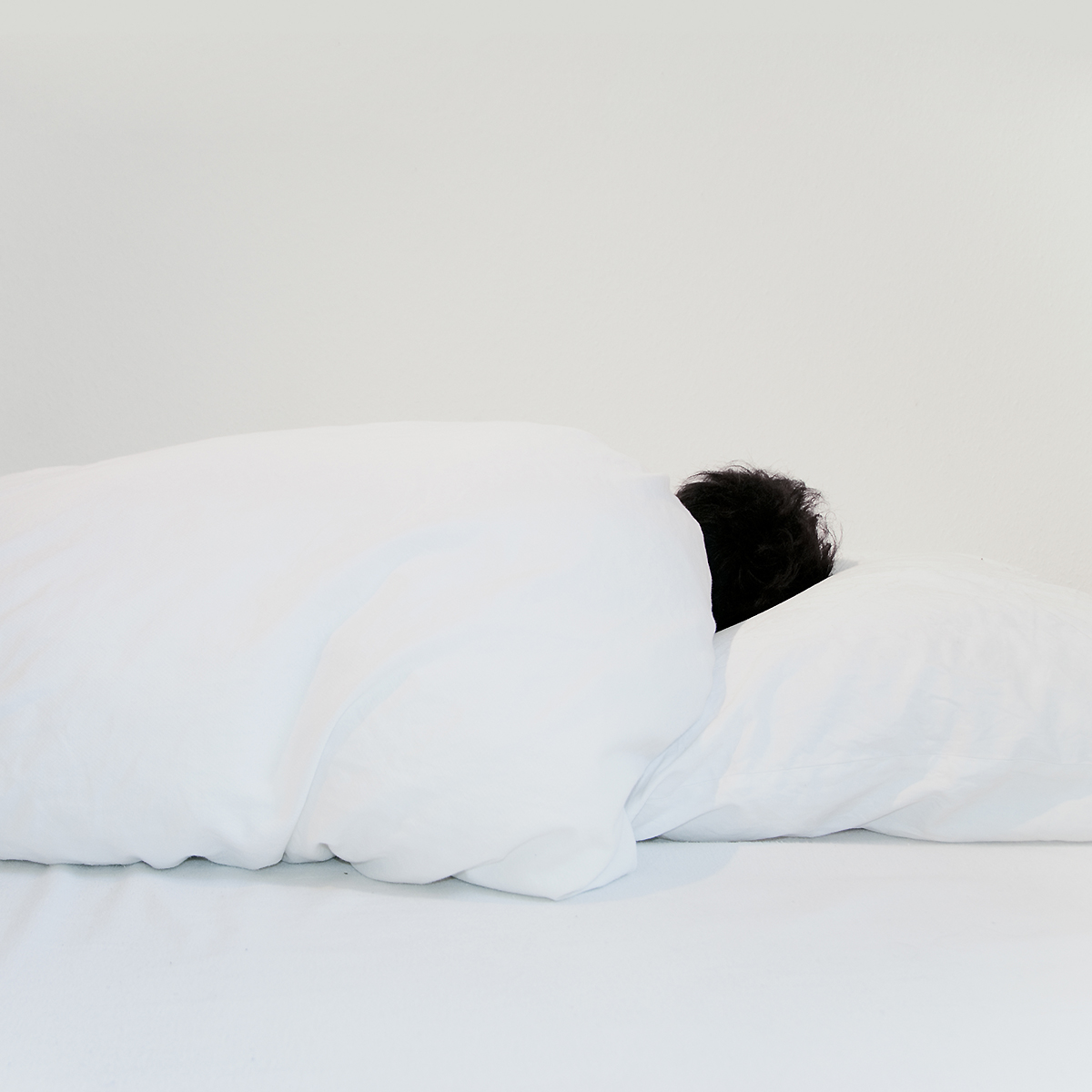
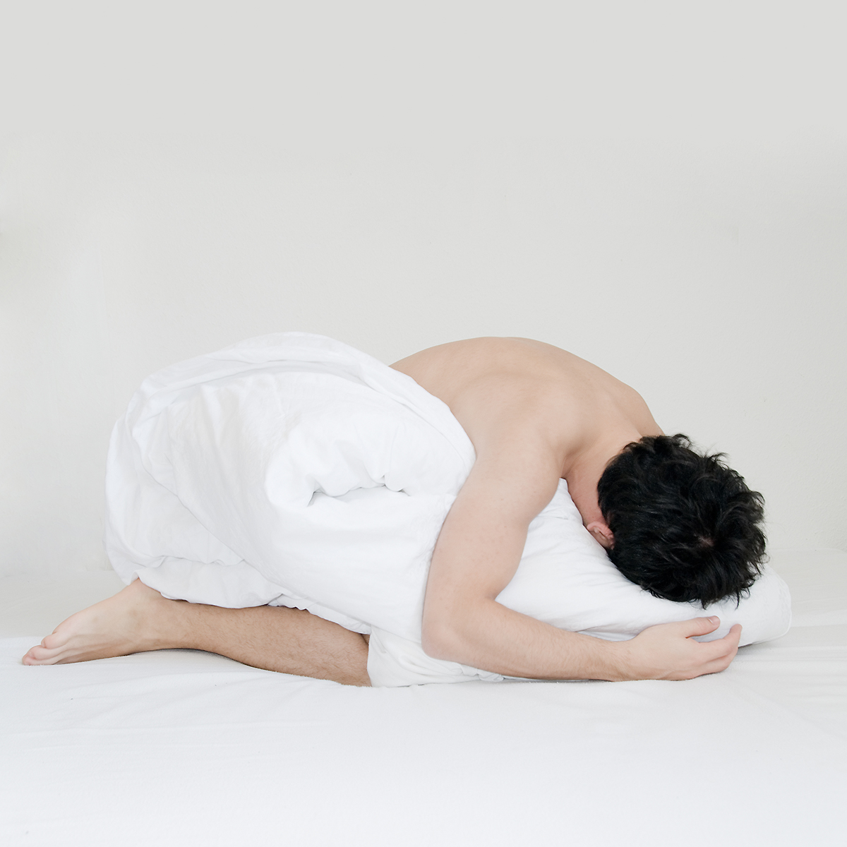
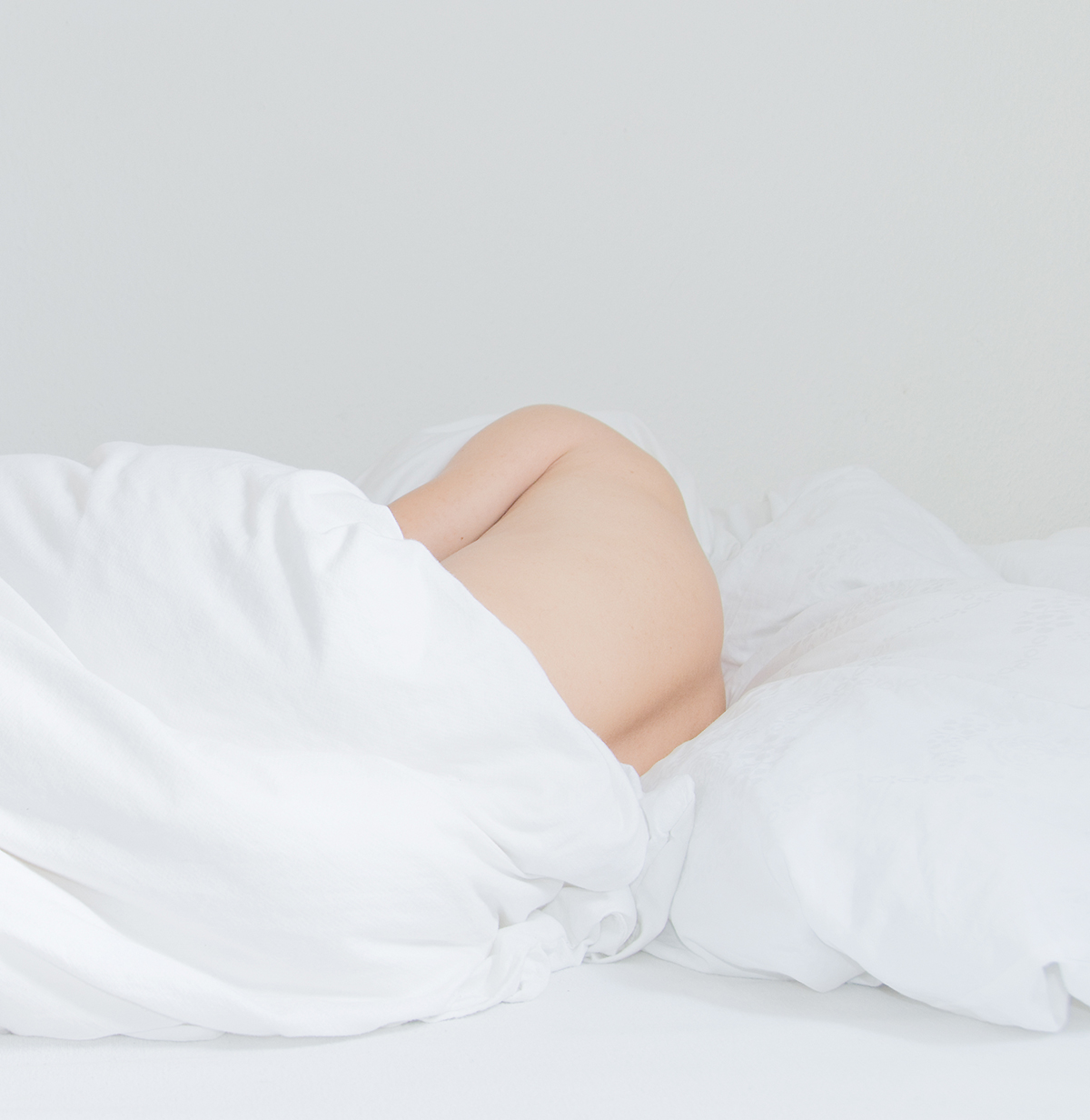
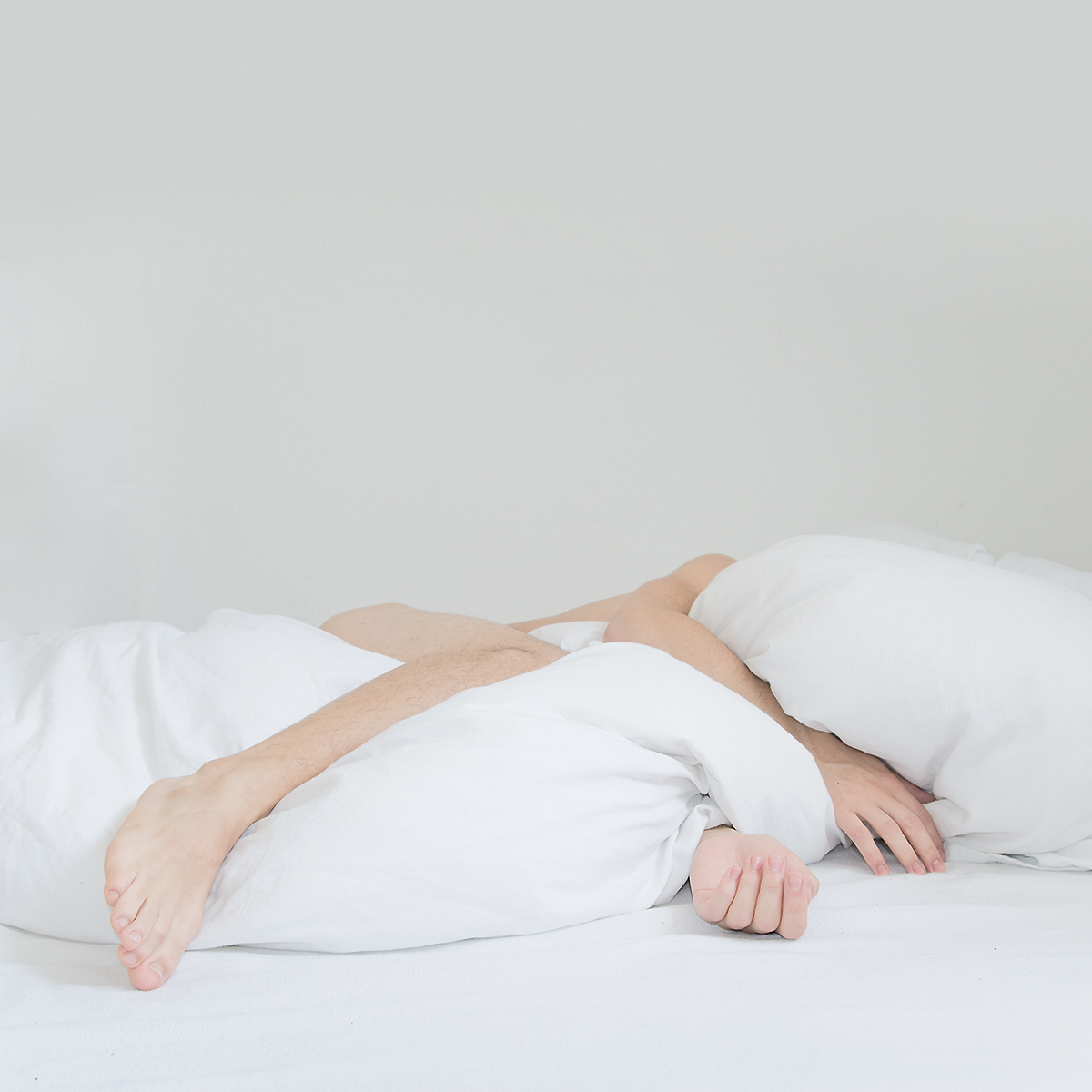
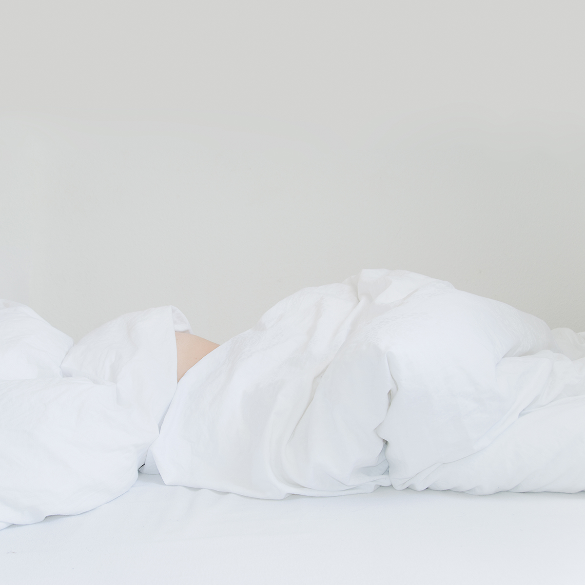
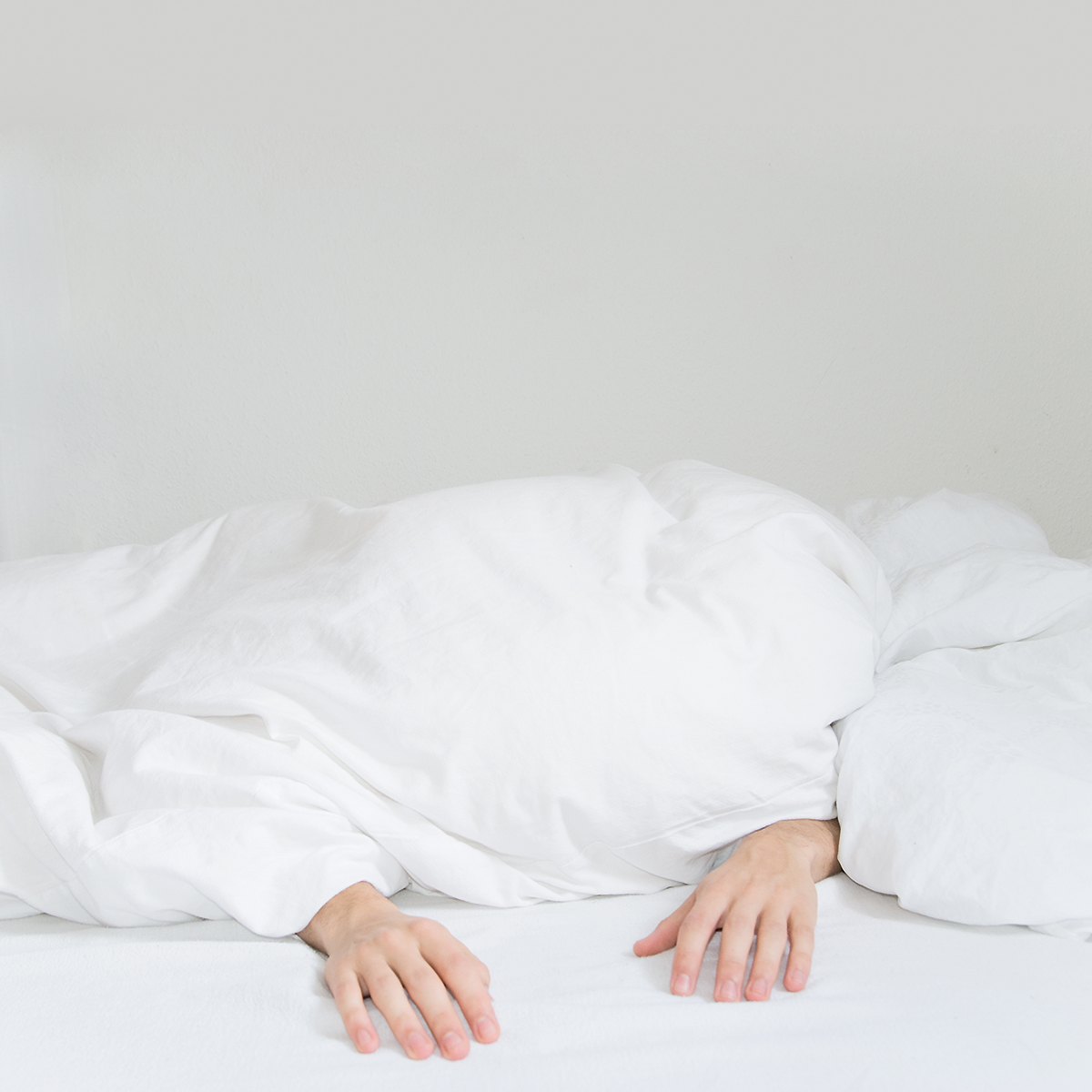
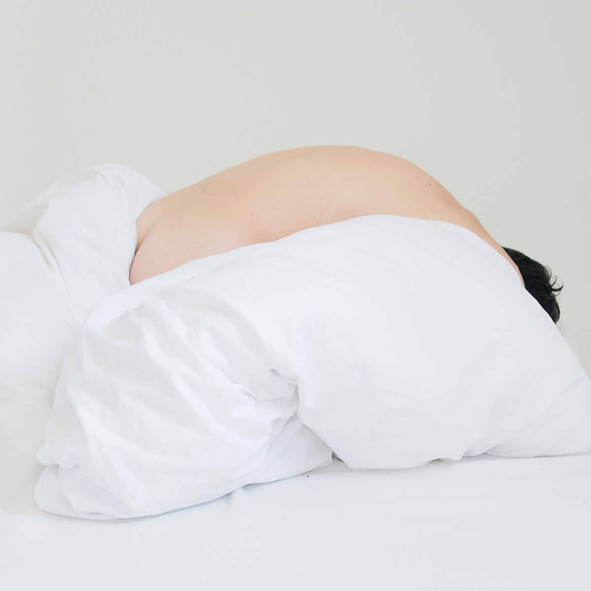
Where does your love for the squared format stem from?
Good question! When I started photography, I got a medium format camera, the Pentacon Six TL. This triggered my obsession with the squared frame. To me it is the ultimate format. As I mentioned before, I like to bring the essence of the idea to stand out in the picture and the square helps a lot. It gives space to the object in the picture. It glorifies it! It centralizes the essence ...
Which camera and lenses do you use the most and what are your favorite settings?
I own a few cameras: on the analog side there’s the Nikkormat, SX-70, Pentacon Six TL, Yashica T5 etc. On the digital side, there’s the Nikon D7200 with mostly fixed focal lenses like 35 mm, 85 mm etc. and a Fuji X100T. Other than that I use Photoshop, Instagram Filters, Scanner Software, and my hands! It is not essential for me with which equipment the picture was made (except if the idea of the work is based on a certain technique), as long as the picture surprises me or tickles my interest.
“I like to bring the essence of the idea to stand out in the picture and the square helps a lot”


What is your favorite typeface? What is your favorite public sign or logo?
It is really exciting to see all the independent type foundries grow and having super fresh fonts, some amazing new technic of variable fonts, but the truth is, I like the classics. It might be overused and boring to most people, but if I needed to pick one, it would be Helvetica. For me it’s the godfather of sans serif fonts, it’s neutral and simply an evergreen.
My favorite logo is definitely the one for the Summer Olympics 1972 by Otl Aicher. Not just the logo though, the whole corporate design. It’s perfectly thought-out and executed. On a purely aesthetical level, I also like another quite similar looking one: The logo from Vertigo Records. It was printed onto vinyl disk inlays sowhen the disks were spinning, the illusion effect of the logo was even stronger. Simply amazing!
What is the most important thing to consider when working with photography, typography, and layout?
The dialogue between them. Nowadays you see a lot of beautiful layouts, at least graphically speaking. But if you really deal with the content, sometimes that extra idea or “aha-effect“ is missing. And looking good is not enough! A magazine that always surprises me is the Zeitmagazin designed by Studio Mirko Borsche. I love the double cover idea. It creates so many story-telling possibilities.


@linuslohoff
Do you have any specific “gestaltung” rules?
No, I actually don’t have any design rules. I mean, there are definitely things you need to consider, but nowadays everything can be deconstructed and the rules broken. Trends like “Pretty/Ugly” or “Variable fonts” are important. It’s about experimenting and exploring new aesthetics, not about the perfect image or readability.
Is there a dream project you’d like to curate?
I don’t have a dream project that I would like to curate, but there’s a dream project I’d like to be part of. It would be awesome to develop an art piece in the Studio Olafur Eliasson. I’d like to assist from the beginning, starting with the research process all the way to the execution. If this wasn’t an option, I would also just love to intern there and watch from behind the scenes.
@linuslohoff
Would you say you are a better at taking pictures or looking at them, judging the even? Why?
Looking at photography. As I mentioned earlier, I do not consider myself a photographer. I consider myself a creative who likes taking photographs. I like the camera to visualize my ideas.
There are a bunch of amazing photographers who could do a better job than me simply becouse they are better trained or just doing it full-time. I am not doing photography full-time. I’m creative full-time. In all kind of ways. Also I will always be better at looking at photography because I am a visual junky. Every time a beautiful image inspires me it makes me happy.
A few artists that inspire and motivate you?
I definitely have to mention Olafur Eliasson. What he is doing around the theme of immateriality and physics is just amazing. His work is scientific, visually appealing, and surprising. Big inspiration! Another one I love is Erwin Wurm. Beside his famous One Minute Sculptures he makes everyday life themes so attractive. His work is so simple in a way but so powerful at the same time.

I totally love this thought of “minimal effort > maximum effect”. Furthermore I have to mention Teenage Engineering, manufacturers of music electronics. I know, they are not traditionally artists. I just love their whole appearance, communication, webpage, and their products. Then there are a bunch of really good photographers and artists that I admire and that give me a lot of inspiration like Salva Lopez, Cocolia, Braulio Amado, Haw-Lin & Akatre.
What can we expect from you in the future—are you currently working on something or planning a new project?
I have two projects in mind that I really want to work on this year. They are both a mix of graphic design and still-life photography with a conceptual approach. The topic is "nonsense". I can't say more though, otherwise it wouldn't be a surprise anymore. Stay tuned! :)